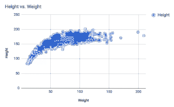
While graphs showing relation between two variables like height and weight can be easily plotted on a flat screen as shown below, things get really messy when we have more than two parameter.
That's when people try to switch to 3D plots, but these are often confusing and clunky which defeats the entire purpose of data visualization. We need heatmaps for visuals.
What are heatmaps?
If you look at the image from a thermal camera you can see a literal heatmap. Thermal imaging camera represents different temperature as different colors. The coloring scheme appeals to our intuition that Red is a “warm color” and takes blue and black to represent cold surfaces.

This view of mars is a really good example where the cold regions are blue in color whereas the warmer regions largely red and yellow. The colorbar in the image shows what color represents what temperature.
Using matplotlib we can associate with a point (x,y) on the graph with a specific color representing the variable that we are trying to visualize. It need not be temperature, it could be any other variable. We will also display a colorbar next to it to indicate users what different colors mean.
Often times you would see people mentioning colormaps instead of heatmaps. These are often used interchangeably. Colormap is a more generic term.
Installing and Importing Matplotlib and Related Packages
To get started with Matplotlib make sure you have Python (preferably Python 3 and pip) installed. You will also need numpy, scipy and pandas to work with datasets. Since we are going to plot a simple function, only two of the packages numpy and matplotlib are going to be necessary.
$ pip install matplotlib numpy#or if you have both python two and three installed
$ pip3 install matplotlib numpy
Once you have installed the libraries, you need to make sure that they are imported in your python program.
import numpy as npimport matplotlib.pyplot as plt
Now you can use the functions supplied by these libraries by using syntax like np.numpyfunction()and plt.someotherfunction().
A Few Examples
Let's start with plotting a simple mathematical function which takes points on a plane (their x and y coordinates) and assigns a value to them. The screenshot below shows the function along with the plot.
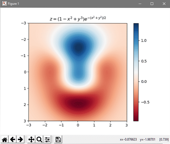
The different colors represent different values (as indicated by the scale next to the plot). Let's look at the code which can be used to generate this.
import numpy as npimport matplotlib.pyplot as plt
# Mathematical function we need to plot
def z_func(x, y):
return (1 - (x ** 2 + y ** 3)) * np.exp(-(x ** 2 + y ** 2) / 2)
# Setting up input values
x = np.arange(-3.0, 3.0, 0.1)
y = np.arange(-3.0, 3.0, 0.1)
X, Y = np.meshgrid(x, y)
# Calculating the output and storing it in the array Z
Z = z_func(X, Y)
im = plt.imshow(Z, cmap=plt.cm.RdBu, extent=(-3, 3, 3, -3), interpolation='bilinear')
plt.colorbar(im);
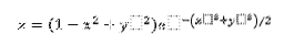
plt.title('$z=(1-x^2+y^3) e^-(x^2+y^2)/2$')
plt.show()
The first thing to notice is that we import just matplotlib.pyplot a small portion of the entire library. Since the project is quite old it has a lot of stuff accumulated over the years. For example, matplotlib.pyplot was popular back in the day but is now just a historical relic and importing it just adds more bloat to your program.
Next we define the mathematical function that we wish to plot. It takes two values (x,y) and returns the third value z. We have defined the function not used it yet.
The next section takes upon the task of create an array of input values, we use numpy for that although you can use the build in range() function for it if you like. Once the list of x and y values are prepared (ranging from negative 3 to 3) we calculate the z value from it.
Now that we have calculated our inputs and outputs, we can plot the results. The plt.imshow() tells python that the image is going to be concerned with Z which is our output variable. It also says that it is going to be a colormap, a cmap, with Red Blue (RdBu) scale extending from -3 to 3 on either axis. The interpolation parameter makes the graph smoother, artificially. Otherwise, your image would look quite pixelated and coarse.
At this point, the graph is created, just not printed. We then add the colorbar on the side to help correlated different values of Z with different colors and mention the equation in the title. These are done in steps plt.colorbar(im) and plt.title(… ). Finally, calling the function shows us the graph on the screen.
Reusablility
You can use the above structure to plot any other 2D colormap. You don't even have to stick to mathematical functions. If you have huge arrays of data in your file system, maybe information about a certain demographics, or any other statistical data you can plug that by modifying the X, Y values without altering the colormap section.
Hope you found this article useful and if you like similar content, let us know.