Prerequisite
If you are a new Python user, then you will first have to set up the environment to show the output of the box plot. You can use any Python interpreter for executing the code. In this tutorial, I will use spyder3 to execute the code. If you have not installed the pandas and seaborn libraries before, then you should run the following command from the terminal to install these libraries:
$ pip3 install pandas seabornBox plots with pandas
The boxplot() method of pandas is used to generate box plot figures based on the data frame. This method contains many arguments; some of these arguments are used in the examples below. This part of the tutorial will include two examples that will show you how to create box plots in pandas. You may use randomly generated data in NumPy library, or the data from a CSV file, to generate a box plot in pandas.
Example 1: Box plots based on random values
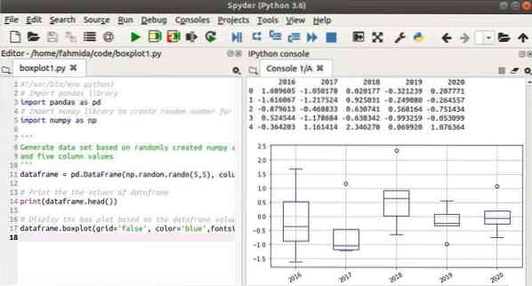
The box plots in the following example were generated using NumPy and pandas. The NumPy library is used in the script to create a data frame object by generating a two-dimensional array of random values that contain 5 rows and 5 columns. The content of the data frame will be printed using the head() method. Next, the boxplot() method is used to generate box plots with blue color, font-size 10, and a 30-degree rotating angle for displaying the column values.
#!/usr/bin/env python3# Import pandas library
import pandas as pd
# Import NumPy library to create the random numbers for the array
import numpy as np
"
Generate data set based on randomly created NumPy array
and five columns values
"
dataframe = pd.DataFrame(np.random.randn(5,5), columns=['2016', '2017', '2018',
'2019', '2020'])
# Print the the values of dataframe
print(dataframe.head())
# Display the box plot based on the dataframe values
dataframe.boxplot(grid='false', color='blue',fontsize=10, rot=30 )
Output
The following output will appear after executing the code.
Example 2: Box plots based on CSV data
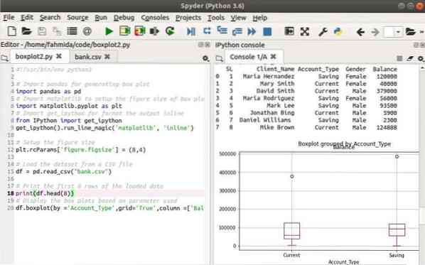
The box plots in the following example were generated from CSV data. Create a CSV file named bank.csv using the following data.
bank.csv
SL,Client_Name,Account_Type,Gender,Balance1,Maria Hernandez,Saving,Female,120000
2,Mary Smith,Current,Female,40000
3,David Smith,Current,Male,379000
4,Maria Rodriguez,Saving,Female,56000
5,Mark Lee,Saving,Male,93500
6,Jonathan Bing,Current,Male,5900
7,Daniel Williams ,Saving,Male,2300
8,Mike Brown,Current,Male,124888
9,Paul Smith,Current,Male,59450
10,Maria Lopez,Saving,Female,487600
In the following script, the matplotlib library was used to set up the figure size of the box plot and to display the output inline. All records of the bank.csv file were loaded using the read_csv() method of pandas. The first 8 records of the data frame were then printed using the head() method. The boxplot() method was used in the following statement to draw the box plot figure using red color based on 'Account_Type' with the column named 'Balance.'
#!/usr/bin/env python3# Import pandas for generating box plot
import pandas as pd
# Import matplotlib to setup the figure size of box plot
import matplotlib.pyplot as plt
# Import get_ipython for format the output inline
from IPython import get_ipython
get_ipython().run_line_magic('matplotlib', 'inline')
# Setup the figure size
plt.rcParams['figure.figsize'] = (8,4)
# Load the dataset from a CSV file
df = pd.read_csv("bank.csv")
# Print the first 8 rows of the loaded data
print(df.head(8))
# Display the box plots based on parameter used
df.boxplot(by ='Account_Type',grid='True',column =['Balance'], color='red')
Output
The following output will appear after executing the code.
Box plots with seaborn
Another library of Python commonly used to draw box plots is the library seaborn. One of the important features of this library is that it has many built-in sample data sets to test different tasks. The next two examples will cover the use of two different sample data sets to draw box plots using the seaborn library.
Example 3: Box plots based on x parameter
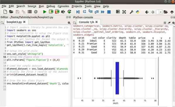
The following example uses a sample dataset, named 'diamonds,' from the seaborn library to generate the box plot. Here, the grid style is defined using the set_style() method. The load_dataset() method is used to load the data of the 'diamonds' dataset. The first five records are printed from the dataset and the boxplot() method is then used to draw the box plot based on the column, named 'depth,' with blue color.
# Import seaborn library to generate box plotimport seaborn as sns
# Import matplotlib to setup the figure size of box plot
import matplotlib.pyplot as plt
# Import get_ipython for format the output inline
from IPython import get_ipython
get_ipython().run_line_magic('matplotlib', 'inline')
# Setup the grid style
sns.set_style("whitegrid")
# Setup the figure size
plt.rcParams['figure.figsize'] = (8,4)
# Load the sample dataset
diamond_dataset = sns.load_dataset('diamonds')
# Display the first 5 records of the dataset
print(diamond_dataset.head())
# Draw the box plots figure
sns.boxplot(x=diamond_dataset['depth'], color='blue')
Output
The following output will appear after executing the code.
Example 4: Box plots based on x and y parameters
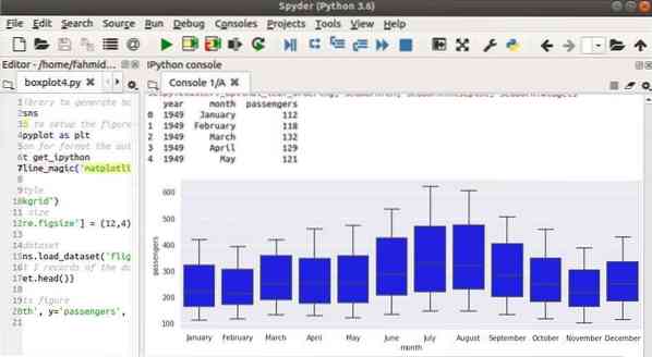
The following example uses the sample dataset named 'flights' to draw the box plot. Here, both the x and the y parameters of the boxplot() method are used to draw the figure. The other statements are similar to the previous example.
# Import seaborn library to generate box plotimport seaborn as sns
# Import matplotlib to setup the figure size of box plot
import matplotlib.pyplot as plt
# Import get_ipython for format the output inline
from IPython import get_ipython
get_ipython().run_line_magic('matplotlib', 'inline')
# Setup the grid style
sns.set_style("darkgrid")
# Setup the figure size
plt.rcParams['figure.figsize'] = (12,4)
# Load the sample dataset
flight_dataset = sns.load_dataset('flights')
# Display the first 5 records of the dataset
print(flight_dataset.head())
# Draw the box plots figure
sns.boxplot(x='month', y='passengers', data=flight_dataset, color='blue')
Output
The following output will appear after executing the code.
Conclusion
When working with a large amount of data, you might want to summarize the data by using a diagram, such as a box plot. This tutorial used several examples to show you how to generate box plots with two Python libraries.


